Design System and UI guidelines
It is tempting to think that a design system is built thoroughly in the earliest stages of production, and that only then its principles are applied to all products. It’s actually rather the opposite, especially when it comes to agile practices. It’s only after numerous actual screen designs were done that I started formalizing general design guidelines. As a matter of fact, a live, informal design system was already up and running through all those screen designs.

Button design guidelines.
These guidelines just add further material to the various use case prototypes, as well as sharing knowledge and good design practices across teams.

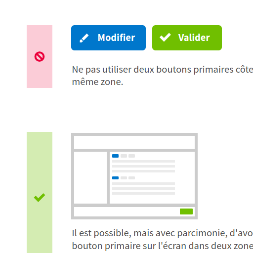
Example of button design dos and don’ts.
Guidelines allow for coherence in visual identity within products as well as consistent, efficient interaction principles for users.

Modal window guidelines covering both visual identity and interaction.
I made a point of integrating animations and interactions in these guidelines, not just text and static screenshots, hopefully avoiding ambiguities. As a result, I provided interactive guidelines, first using HTML, CSS and Javascript, and later on the UXPin prototyping tool to address our needs for collaborative work.


